WeCare Dental / Care, for all of usA story the practice can live.
A story the practice can live.
A family brings different people and different questions through the same door. A child's first visit. A parent returning to routine care. A grandparent who wants more time to talk. WeCare Dental makes room for each person. The team learns names, explains care in everyday language and keeps the next step clear. That promise sits inside the name itself: the a in care brings two adults and a child together, with a small tooth at the centre. Emerald lettering and warm oak make the welcome visible. The practice becomes a familiar part of local life, while every person's care remains their own.
For local households seeking an ongoing dental home, WeCare Dental combines a warm family welcome with individual attention and clear everyday care.
The patient promise
A familiar welcome. Care that sees each person.
Behaviours that make it credible
Address children and adults directly, in language each can understand.
Ask about the people, routines and access needs behind an enquiry.
Give each person an appropriate, clearly explained care summary.
WeCare Dental / Care, for all of usThree people to design for.
Three people to design for.
Illustrative client profiles. Portraits are AI-generated; names and situations are fictional.
01 / The family organiser
Priya + household
Parent, 36 · Children, 5 and 9
Priya is choosing a long-term dental home for herself and her children. She wants one familiar team that notices everyone's different needs.
What matters
A warm welcome, clear preparation and practical scheduling.
Brand response
Show family life and explain care for each age clearly.
02 / The growing household
Chris + Morgan
Adults, 43 and 46 · Teenager, 15
Chris and Morgan want care that grows with their household. Their teenager needs more independence while the adults need dependable routine care.
What matters
Respectful conversations and room for each person's questions.
Brand response
Balance family warmth with an adult tone. Speak directly to teenagers.
03 / The care coordinator
Lena + her father
Adult, 47 · Parent, 73
Lena is finding care for herself and helping her father prepare for visits. Both want clear information and control over their own decisions.
What matters
Readable directions, patient explanations and agreed caregiver involvement.
Brand response
Show different generations. Give each person a clear, individual care summary.
WeCare Dental / Care, for all of usPersonality with a purpose.
Personality with a purpose.
The family wants one familiar place, while every person needs to feel heard as an individual.
Begin with people. Then make the practical details easy to understand.
Avoid babyish language for the whole practice, assumptions about family roles, cold software-style graphics and promises of effortless or guaranteed care.
01
Welcoming
Learn names. Address everyone in the room.
02
Personal
Ask what matters to this person, at this visit.
03
Clear
Explain the next step in everyday language.
04
Dependable
Carry useful information through booking, care and follow-up.
WeCare Dental / Care, for all of usA family within care.
A family within care.
The selected logo
The welcome is part of the name.
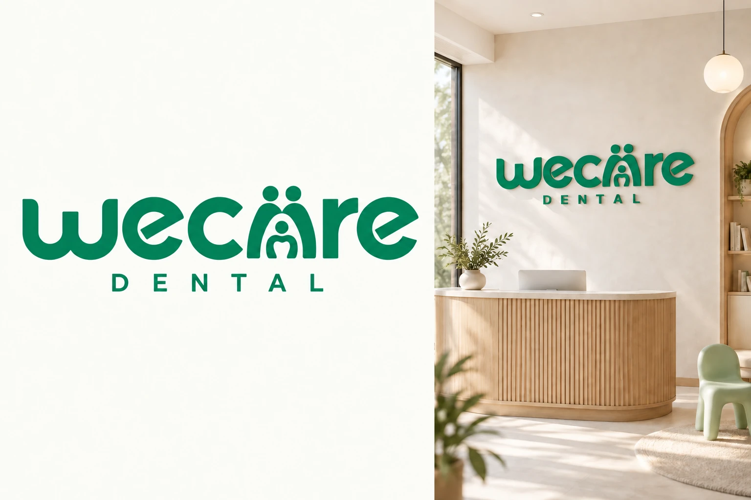
The family lives inside the a in care. Two adult figures form its outer shape; a smaller child sits between them, with a tooth revealed in negative space. Together, they connect the name to the people the practice welcomes and the care it provides. The rounded lettering keeps the wordmark approachable. One continuous emerald colour holds the whole name together. The figures suggest family and support without defining who belongs to a household. Care for all of us becomes a promise carried by the name itself.
01
The family a
Two adults frame a child within the letter. Keep all three heads, the open gaps and the shared baseline intact.
02
A tooth within the child
The small negative-space tooth makes dentistry part of the family story. Preserve its opening at every size.
03
One name, one emerald
The full wordmark and DENTAL line use emerald together. The family detail belongs within the name, between c and r.
WeCare Dental / Care, for all of usHow the logo carries the message.
How the logo carries the message.
Concept application. The supplied vector masters control the final logo drawing.
WeCare Dental is the practice name. Modern family dentistry describes its focus. Care, for all of us names the creative direction.
First impression
Care for all of us.
Lead with the integrated wordmark and everyday family portraits. Show care for different ages while keeping each service clear.
Inside the practice
Hello again.
Use emerald lettering against warm chalk and oak. Adult and child seating turn the family welcome into a practical choice.
After the visit
Your care, at a glance.
Give each person an individual summary carrying the same emerald wordmark. Familiar branding connects the visit to its next step.
WeCare Dental / Care, for all of usLogo versions and clear space.
Logo versions and clear space.
Lettering / name already established
Light logo / emerald backgrounds
Family-a icon / name is nearby
Let x equal the height of the DENTAL line. Leave 2x around the full logo, measured from the outer letters and the tallest heads. Around the family-a icon, leave one-quarter of its width on every side.
Keep the detail readable.
Full logo: 220 px / 45 mm wide. Lettering alone: 180 px / 38 mm. Family-a icon: 48 px / 12 mm. Check the child and tooth opening at the final size.
Keep the family a inside the primary wordmark. All letters and the DENTAL line share one colour. The compact master preserves the same drawing; use lettering alone in smaller spaces. The icon is for contexts where the name is already clear.
WeCare Dental / Care, for all of usProtect the recognition.
Protect the recognition.
Use the supplied masters. Rebuilding a logo from live type changes its spacing and proportions.
Do not stretch the proportions.
Do not rotate the full lockup.
Do not add shadows or effects.
Do not invent or split logo colours.
Do not crop the practice name.
Do not crowd the clear space.
WeCare Dental / Care, for all of usColour, with intention.
Readable text on the primary field.4.60:1 contrast
Use the ink colour for body text on light and accent backgrounds. Accent colours are fields or highlights, not small text colours.
CMYK values are approximate starting points, calculated from RGB. Convert with the printer's ICC profile and proof the actual stock. No Pantone equivalence is asserted.
WeCare Dental / Care, for all of usTypography sets the tone.
Typography sets the tone.
Display / SpaceGrotesk
Aa Bb 012345
Space Grotesk gives short headings clear, open shapes. Its rounded forms connect with the lettering. DM Sans keeps explanations comfortable to read. Use a conversational rhythm and generous line spacing.
Reading / DM Sans
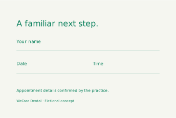
Clear information. A familiar next step.
Display 96 / 96 px
We care.
Mobile 56 / 58
Section heading 48 / 52 px
Hello again.
Mobile 34 / 38
Body 18 / 28 px
Good information deserves room.
Mobile 16 / 25
Label 12 / 18 px
Your next step
Never below 12
Use sentence case. Limit reading lines to about 45 to 75 characters. Keep body tracking at zero. Display tracking may range from -0.04em to 0; labels may use +0.08em.
Fonts and SIL Open Font License copies are included. Logo lettering is outlined; never typeset it again. Use DM Sans or Arial as a functional fallback.
WeCare Dental / Care, for all of usA visual language of its own.
A visual language of its own.
The care arch
A softened arch borrows the enclosing gesture of the two adults in the family a. It frames space for people and their stories. Its rounded ends echo the wordmark, while the complete family symbol remains reserved for the logo.
Use the motif with restraint.
Use the supplied arch upright, with rounded ends. Scale it evenly.
Use one arch as a quiet frame, or the supplied repeat at low emphasis.
Keep faces and essential information clear of the arch. Do not add heads or teeth to the pattern.
Use sage and eucalyptus as soft supporting colours. Emerald identifies the practice.
Use a 12-column desktop grid and four columns on mobile. Base spacing is 8 px. Panels use 16 px corners; buttons use 8 px. Prioritise one primary action in each section.
Keep the motif behind the story. One recognisable gesture is enough to connect an application to the practice.
WeCare Dental / Care, for all of usSmall assets. Same character.
Small assets. Same character.
Calendar
Conversation
Location
Care Note
Person
Next Step
One family of six.
Every icon sits on a 48 × 48 unit grid and uses a consistent stroke. The proportions remain the same in buttons, wayfinding and printed materials.
Use icons at 24, 32 or 48 px. Pair unfamiliar icons with words. Keep them in the primary or ink colour. Do not substitute emojis or a second icon library.
Questions welcome A label gives the symbol meaning.
Stroke widths in the 48-unit source grid: 2.5 units, rounded ends and controlled geometry.
Check the chosen logo at its stated minimum. Fine lines and facial details need a physical proof for embroidery or debossing.
WeCare Dental / Care, for all of usPhotography with a point of view.
Photography with a point of view.
AI-generated concept photography. Fictional scene; no clinical outcome or patient endorsement.
Show the warmth between people at eye level. Use natural light, relaxed expressions and familiar everyday clothing. Include different ages and households across the image library.
The shoot list
A child and grown-up arriving together
A team member listening to an adult or teenager
An older adult discussing their own care
Reception seating with room for different ages
A care summary explained to its recipient
Avoid staged family line-ups, a single stereotype of family, oversized cartoon props, tech stock imagery and rooms with no visible warmth.
In a real clinic, replace concept images with approved photography and document permissions. Captions describe the actual image. Alternative text describes useful content, not marketing adjectives.
WeCare Dental / Care, for all of usA voice people can recognise.
A voice people can recognise.
Write as the team would speak to this patient. Keep the invitation specific and the next step clear.
Situation
Use this approach
Avoid
First visit
Tell us who is coming and what would help you prepare.
A seamless dental solution for the whole household.
Children and teens
We will explain each step and make room for questions.
Our little patients are always brave.
Grown-ups
What would you like to understand about your care?
Parents first. Your own care can wait.
Follow-up
Here is the next step we discussed with you.
The whole family is covered.
Use everyday words, direct sentences and specific invitations. Address the person's question before describing the practice.
Publish only claims the practice can support. The examples here express a proposed experience; the clinic must be able to deliver it.
WeCare Dental / Care, for all of usA headline system, not one line.
A headline system, not one line.
Care for all of us.
One familiar place. Care for each of you.
A familiar team as life changes.
Little smiles. Grown-up questions.
Your questions belong here.
A clearer picture of your care.
Hello again. How have you been?
Care that listens to each of you.
Primary invitation
Plan a first visit
Use the main brand line on the homepage and introduction pieces. Use supporting lines for individual stories. Pair every abstract headline with a concrete explanation or next step.
WeCare Dental / Care, for all of usThe story becomes a homepage.
The story becomes a homepage.
WeCare Dental / Homepage concept
Our practiceFamily careYour first visitPlan a first visit
MODERN FAMILY DENTISTRY
Care for all of us.
A familiar dental home for children, grown-ups and changing routines. Personal attention, clear explanations and a next step you understand.
Plan a first visit
Care at different ages: individual service needsYour first visit: people, preparation and questions
Content order: Care at different ages: individual service needs → Your first visit: people, preparation and questions → Meet the team: a familiar local practice.
Visual concept, not a live practice website. Buttons in this printed example illustrate hierarchy. Contact details, clinical services and booking integrations would be confirmed before launch.
WeCare Dental / Care, for all of usA useful next step on mobile.
A useful next step on mobile.
Care for all of us.
A familiar dental home for children, grown-ups and changing routines. Personal attention, clear explanations and a next step you understand.
Plan a first visit
Let's plan your first visit.
Our team confirms each appointment and explains how to share private care information.
Send an enquiry
Microcopy matters.
01
Tell us who the visit is for.
02
Our team will confirm availability and explain how to prepare.
03
Thank you. We will contact you to plan the next step.
Concept screens shown at reduced scale. Production controls use visible labels, descriptive errors, keyboard focus and a minimum 44 × 44 px target. Do not preselect consent or collect unnecessary health information.
WeCare Dental / Care, for all of usContent that belongs to the brand.
Content that belongs to the brand.
Post one / caption
A child's first visit and a grown-up's questions deserve their own attention. Tell us who is coming and how we can help you prepare.
Post two / caption
Children grow. Routines change. A familiar team keeps listening to the person in front of them.
Feed 1080 × 1350 px. Story 1080 × 1920 px. Keep story essentials outside the top and bottom 250 px interface zones. Editable SVG masters are included.
WeCare Dental / Care, for all of usEveryday things, considered.
Everyday things, considered.
Staff name Approved role WeCare Dental
Care, for all of us
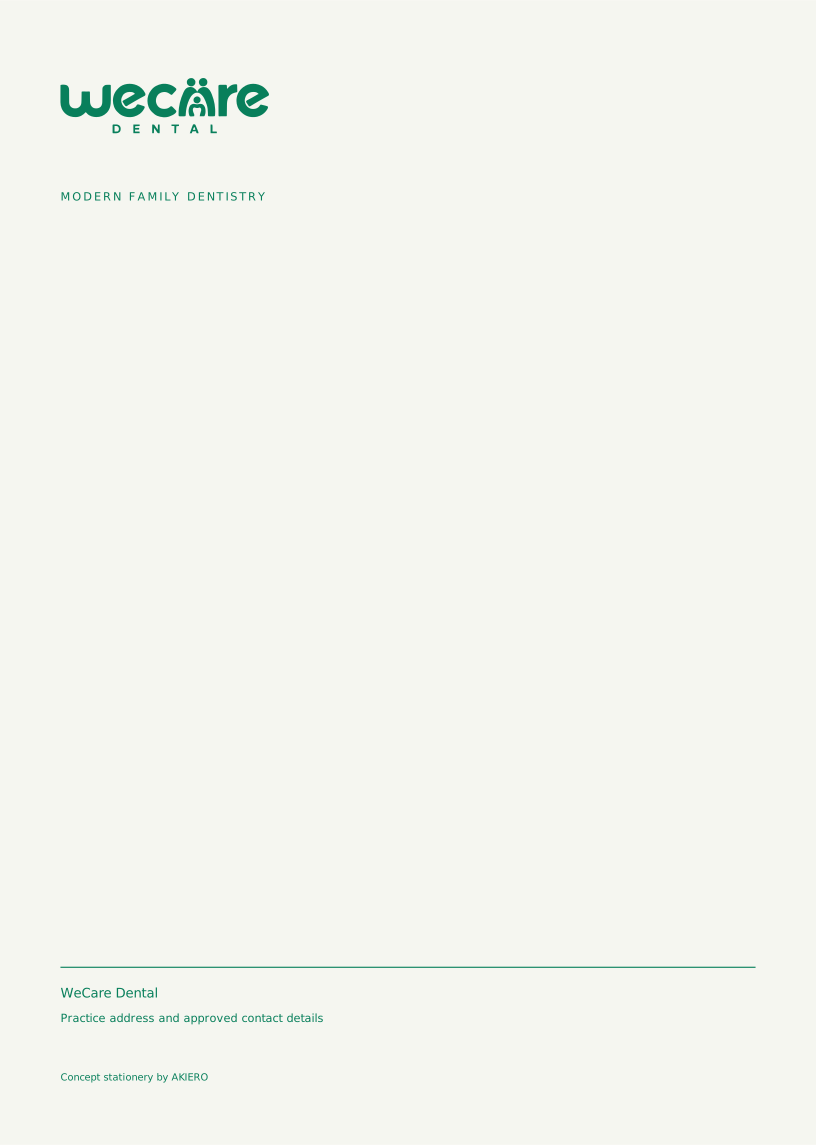
Business / appointment card: 85 × 55 mm trim with 3 mm bleed. Letterhead: A4 trim with 3 mm bleed. Keep essential text at least 5 mm inside trim. Artwork includes the bleed area.
Replace generic contact fields with approved practice details. The email signature uses system type for compatibility. Send print files through the printer's colour conversion and proof workflow.
WeCare Dental / Care, for all of usYour care, at a glance.
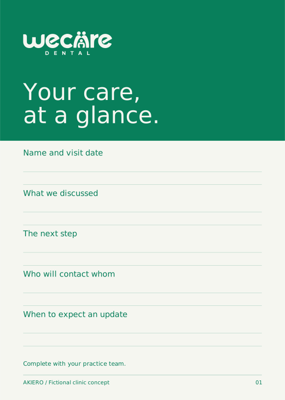
Your care, at a glance.
The clinic signature
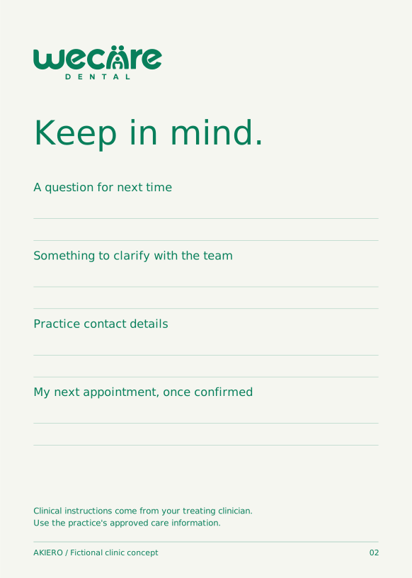
A two-sided A5 care summary with a matching digital layout. Today, Next and Keep in mind give each person a clear record. Complete one summary per patient; share with a caregiver when appropriate and agreed.
How the team uses it
Your question for next time ____ · Practice contact details ____ · For clinical instructions, refer to your clinician's approved care information.
The complete printable signature document is included, alongside editable page masters. The practice completes personal and clinical details through its approved process.
WeCare Dental / Care, for all of usA recognisable place to arrive.
A recognisable place to arrive.
Welcome →Your care →Questions welcome →
Arrival line
A familiar welcome for every age.
Materials
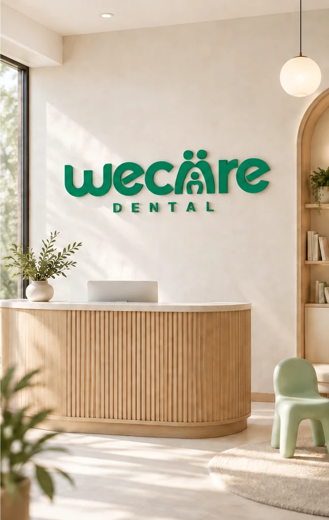
Warm oak, chalk-coloured surfaces and matte emerald lettering. A sage cushion or child chair adds warmth. Mix comfortable adult seating with a small child-height seat and clear circulation.
Uniforms
Emerald or graphite clinical attire with the integrated wordmark. A clearly written name and role keep introductions personal.
Illustrative material and signage concept. The logo story guides the welcome; detailed fabrication follows the actual site.
WeCare Dental / Care, for all of usAn asset library ready to use.
An asset library ready to use.
Family
Delivered
Use
Logo family
9 vector SVG files
Primary: the emerald wordmark with the family a and DENTAL line. The compact file uses the same integrated drawing. Lettering alone is a secondary version. The family-a icon is reserved for contexts where the practice name is already clear.
Graphic system
Pattern + 6 individual icons
Transparent SVGs; character treatments also supplied for the children's practice.
Social
2 feed posts + 1 story
Editable SVGs, fonts embedded; raster exports included in the presentation bundle.
Print essentials
Card front / reverse + letterhead
SVG files with specified physical artboards and 3 mm bleed.
Clinic signature
Complete printable document + SVG pages
A two-sided A5 care summary with a matching digital layout. Today, Next and Keep in mind give each person a clear record. Complete one summary per patient; share with a caregiver when appropriate and agreed.
Team tools
Email signature + design tokens
Editable HTML, JSON palette and spacing tokens, complete brand copy.
SVG logo masters contain outlined lettering and remain sharp at any size. Collateral SVGs contain editable text and embedded fonts. Keep the editable sources alongside exported PNGs.
Source naming: asset-purpose-variant.svg. Use the supplied approved colour versions. Copy a master before adapting it, and name new exports with the channel and date.
WeCare Dental / Care, for all of usThe promise has to show up.
The promise has to show up.
01
First hello
Ask who is coming and what each person needs to prepare.
Reception
02
Welcome
Greet each person by name and explain where to go.
Front desk
03
Care
Speak to the patient directly and invite their questions.
Clinical team
04
Follow-up
Provide an individual care summary and confirm its next step.
Care team
These are proposed service behaviours for the fictional concept. The clinic owner must confirm capability, train the team and adapt the process before the promise appears in live marketing.
WeCare Dental / Care, for all of usDetails that keep the system intact.
Details that keep the system intact.
Layout
Use a 12-column desktop grid and four columns on mobile. Base spacing is 8 px. Panels use 16 px corners; buttons use 8 px. Prioritise one primary action in each section.
Legibility
Use approved high-contrast text pairs. Normal text should meet at least 4.5:1 contrast, and large text 3:1. Convey meaning through words or shapes as well as colour. Keep meaningful content available when imagery is absent.
Motion
Use a quiet 160 ms transition for focus and selected states. Keep the family a intact and the logo still. Appointment feedback must distinguish a request from a confirmation.
Digital exports
Use SVG for identity and icons. Export social artwork as PNG at the stated size. Keep the colour space sRGB. Compress editorial photography for web without removing useful texture.
Print production
Use vector artwork and 300 ppi placed images at final size. Bleed is 3 mm where specified. Keep a 5 mm text-safe margin inside trim. Ask the printer to convert using its output profile and supply a proof.
Photography and clinical content
Keep concept photographs labelled as illustrative. Use only approved real-clinic imagery for live work. Verify service claims and clinician credentials; this identity does not establish a dental specialty or an outcome.
WeCare Dental / Care, for all of usKeep the idea recognisable.
Keep the idea recognisable.
Before anything goes live.
Confirm that the story and promise match the practice.
Select the correct logo master and check clear space.
Use the supplied colours, type and graphic family.
Read the copy aloud against the voice examples.
Verify all service, contact and clinician information.
Check mobile reading, contrast and alternative text.
Review image permissions and illustrative labels.
Get practice-owner approval and keep a dated master.
A brand refresh should preserve these principles. Changes to the promise, logo or type system need a deliberate review rather than a one-off campaign decision.
Begin with people. Then make the practical details easy to understand.
Concept identities by AKIERO. All clinic stories and avatars are fictional. Name and mark clearance, clinical review and production proofing remain prerequisites for real-world use.