WeCare Dental / An individual studyA story the practice can live.
A story the practice can live.
A smile belongs to a person before it becomes a treatment conversation. WeCare Dental begins with what they value in their expression, what they want to understand and what they might prefer to keep. The consultation gives those details room. The identity follows the same approach. Custom WECARE lettering carries the whole name, with flowing connections and precise contrasts that reward a closer look. Oxblood, warm paper and quiet layouts give it presence. The likeness journal carries the conversation into a personal record of questions and preferences. The brand makes careful attention visible before any treatment decision.
For adults considering veneers who value individual expression and a considered decision, WeCare Dental offers a personal consultation experience centred on preferences, suitability and clear options.
The patient promise
We will begin by understanding what feels like you.
Behaviours that make it credible
Ask what the person wants to preserve as well as change.
Explain suitability, alternatives and limitations before a treatment decision.
Document preferences without presenting the journal as a clinical prescription.
WeCare Dental / An individual studyThree people to design for.
Three people to design for.
Illustrative client profiles. Portraits are AI-generated; names and situations are fictional.
01 / The likeness protector
Elena
39 · Creative business owner
Elena is a creative business owner considering a subtle change. She wants her smile to keep the character that makes it feel like hers.
What matters
Individual attention and a thoughtful discussion of alternatives.
Brand response
Use natural portraits and personal questions. Make the likeness journal central.
02 / The deliberate decision-maker
Marcus
52 · Client-facing professional
Marcus is a client-facing professional revisiting a long-standing concern. He researches carefully and wants to understand the commitment before deciding.
What matters
Clear stages, suitability, maintenance and estimated costs.
Brand response
Pair the quiet visual style with practical consultation information.
03 / The discerning researcher
Rina
31 · Independent consultant
Rina is comparing veneer providers after seeing cosmetic content online. She wants to separate personal taste from what is clinically suitable.
What matters
Credible information, transparent imagery and a clinician who listens.
Brand response
Explain image context and treatment choices. Make the consultation easy to explore.
WeCare Dental / An individual studyPersonality with a purpose.
Personality with a purpose.
The patient is interested in a change but wants to preserve their identity and make an informed decision.
Give the name, the person and their questions enough room.
Do not use fake before/after images, clinical-looking seals of approval, status language, extreme letter spacing in body text, or heavy gold gradients.
01
Observant
Notice the individual. Ask before suggesting.
02
Cultured
Use the restraint and attention of an editorial portrait, with accessible language.
03
Personal
Speak to one person without flattery or assumptions about their self-worth.
04
Measured
Make room for questions, alternatives and a decision over time.
WeCare Dental / An individual studyThe name carries the signature.
The name carries the signature.
The selected logo
Distinctive detail, held in one name.
The custom WECARE wordmark is the logo. Its high-contrast letterforms balance precision with a softer, flowing connection through the E, C and A. That combination supports the brand's interest in individual expression and considered detail. The complete name does the work: it identifies the practice and gives the identity its signature. Oxblood ink, warm paper and generous space let the drawing be seen clearly. DENTAL remains a quiet descriptor beneath the name.
01
Custom lettering
The name is drawn as a complete composition. Preserve its proportions, spacing and contrast rather than setting it in a display font.
02
A connected gesture
The flowing middle letters give the wordmark its signature. This curve also informs the restrained supporting line pattern.
03
A quiet setting
Oxblood on porcelain, or porcelain on oxblood, gives the letters room. The material and spacing carry the premium character.
WeCare Dental / An individual studyHow the logo carries the message.
How the logo carries the message.
Concept application. The supplied vector masters control the final logo drawing.
WeCare Dental is the practice name. Veneers & smile design describes its focus. An individual study names the creative direction.
In the message
Recognisably you.
Pair the complete wordmark with a natural portrait and a clear explanation of the consultation.
In the materials
The details are personal.
Use the full wordmark on the card and journal. Choose warm uncoated paper, oxblood cloth and a carefully proofed impression.
In the consultation
What would you like to keep?
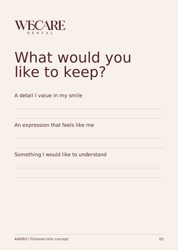
The likeness journal gives individual preferences the same attention the identity gives individual letterforms.
WeCare Dental / An individual studyLogo versions and clear space.
Logo versions and clear space.
Wordmark / already identified contexts
Light logo / oxblood backgrounds
One ink / complete wordmark
Let x equal the height of the DENTAL line. Leave at least 2x around the logo and 3x on the journal cover. For WECARE alone, allow one-quarter of the capital height on every side.
Keep the detail readable.
Primary with DENTAL: 220 px / 48 mm wide. WECARE alone: 160 px / 35 mm. Below those widths, move identification to a larger placement. Do not invent a small W emblem.
Use the complete name at a readable size. The identity has no standalone symbol. At small sizes, use the lettering-only master or move the logo to a larger placement.
WeCare Dental / An individual studyProtect the recognition.
Protect the recognition.
Use the supplied masters. Rebuilding a logo from live type changes its spacing and proportions.
Do not stretch the proportions.
Do not rotate the full lockup.
Do not add shadows or effects.
Do not invent logo colours.
Do not crop the practice name.
Do not crowd the clear space.
WeCare Dental / An individual studyColour, with intention.
Readable text on the primary field.11.71:1 contrast
Use the ink colour for body text on light and accent backgrounds. Accent colours are fields or highlights, not small text colours.
CMYK values are approximate starting points, calculated from RGB. Convert with the printer's ICC profile and proof the actual stock. No Pantone equivalence is asserted.
WeCare Dental / An individual studyTypography sets the tone.
Typography sets the tone.
Display / CormorantGaramond
Aa Bb 012345
Cormorant Garamond supplies an editorial, portrait-like quality. DM Sans grounds the experience in practical readability. Display type has room to breathe; essential information never uses fine serif text at small sizes.
Reading / DM Sans
Clear information. A familiar next step.
Display 96 / 96 px
We care.
Mobile 56 / 58
Section heading 48 / 52 px
Hello again.
Mobile 34 / 38
Body 18 / 28 px
Good information deserves room.
Mobile 16 / 25
Label 12 / 18 px
Your next step
Never below 12
Use sentence case. Limit reading lines to about 45 to 75 characters. Keep body tracking at zero. Display tracking may range from -0.04em to 0; labels may use +0.08em.
Fonts and SIL Open Font License copies are included. Logo lettering is outlined; never typeset it again. Use DM Sans or Arial as a functional fallback.
WeCare Dental / An individual studyA visual language of its own.
A visual language of its own.
The signature curve
Fine, open contours echo the flowing connection in the custom wordmark. Their role is to frame space around a portrait or a question. They are supporting artwork, never a substitute logo.
Use the motif with restraint.
Use one contour treatment per layout. Keep fine lines visible at the final size.
Give portraits simple 4:5 or 3:4 crops and room around the face.
Scale the supplied contour master uniformly and crop only at the artboard edge.
Use the full wordmark for identification. Keep curves separate from letters and clinical imagery.
Use a six-column editorial grid with generous outer margins. Align body copy to one consistent edge. Keep one large typographic gesture per composition. Square corners for paper; softly framed portraits only.
Keep the motif behind the story. One recognisable gesture is enough to connect an application to the practice.
WeCare Dental / An individual studySmall assets. Same character.
Small assets. Same character.
Calendar
Conversation
Location
Care Note
Person
Next Step
One family of six.
Every icon sits on a 48 × 48 unit grid and uses a consistent stroke. The proportions remain the same in buttons, wayfinding and printed materials.
Use icons at 24, 32 or 48 px. Pair unfamiliar icons with words. Keep them in the primary or ink colour. Do not substitute emojis or a second icon library.
Questions welcome A label gives the symbol meaning.
Stroke widths in the 48-unit source grid: 1.7 units, fine but legible at the intended size.
Check the chosen logo at its stated minimum. Fine lines and facial details need a physical proof for embroidery or debossing.
WeCare Dental / An individual studyPhotography with a point of view.
Photography with a point of view.
AI-generated concept photography. Fictional scene; no clinical outcome or patient endorsement.
Use editorial portraits with a natural expression and visible skin texture. Warm sidelight, tactile clothing and quiet backgrounds. The subject has presence beyond their teeth.
The shoot list
A natural three-quarter portrait with personal expression
The clinician listening during an approved consultation
The journal with a pen and a simple material detail
The consultation space in warm daylight
Hands reviewing a plan without readable private information
Avoid digitally whitened teeth, before/after implications, jewellery-store black and gold, beauty filters, sexualised cropping and imagery that equates treatment with social status.
In a real clinic, replace concept images with approved photography and document permissions. Captions describe the actual image. Alternative text describes useful content, not marketing adjectives.
WeCare Dental / An individual studyA voice people can recognise.
A voice people can recognise.
Write as the team would speak to this patient. Keep the invitation specific and the next step clear.
Situation
Use this approach
Avoid
Aspiration
A conversation about what feels like you.
Your dream smile, guaranteed.
Consultation
We begin with your preferences and assess suitability.
Everyone is a candidate.
Value
A personal plan, explained in detail.
Exclusive smiles for elite clients.
Imagery
Illustrative brand portrait. No treatment result shown.
See the transformation you can expect.
Use everyday words, direct sentences and specific invitations. Address the person's question before describing the practice.
Publish only claims the practice can support. The examples here express a proposed experience; the clinic must be able to deliver it.
WeCare Dental / An individual studyA headline system, not one line.
A headline system, not one line.
Recognisably you.
An individual study in expression.
The details are personal.
Begin with a conversation.
What would you like to keep?
A considered approach to veneers.
Your preferences deserve attention.
A smile has a point of view.
Primary invitation
Request a consultation
Use the main brand line on the homepage and introduction pieces. Use supporting lines for individual stories. Pair every abstract headline with a concrete explanation or next step.
WeCare Dental / An individual studyThe story becomes a homepage.
The story becomes a homepage.
WeCare Dental / Homepage concept
Our approachThe consultationAbout the practiceRequest a consultation
VENEERS & SMILE DESIGN
Recognisably you.
A considered conversation about veneers, expression and the details that make a smile your own.
Request a consultation
An individual approach: preferences before a planA considered process: conversation and suitability
Content order: An individual approach: preferences before a plan → A considered process: conversation and suitability → Questions worth asking: options, maintenance and costs.
Visual concept, not a live practice website. Buttons in this printed example illustrate hierarchy. Contact details, clinical services and booking integrations would be confirmed before launch.
WeCare Dental / An individual studyA useful next step on mobile.
A useful next step on mobile.
Recognisably you.
A considered conversation about veneers, expression and the details that make a smile your own.
Request a consultation
Begin with a conversation.
Please do not send clinical photographs or sensitive health information through this general enquiry form.
Send an enquiry
Microcopy matters.
01
Tell us what you would like to understand.
02
A consultation explores suitability and options; it does not commit you to treatment.
03
Thank you. Our team will contact you to discuss consultation availability.
Concept screens shown at reduced scale. Production controls use visible labels, descriptive errors, keyboard focus and a minimum 44 × 44 px target. Do not preselect consent or collect unnecessary health information.
WeCare Dental / An individual studyContent that belongs to the brand.
Content that belongs to the brand.
Post one / caption
A consultation starts with listening. What feels like you, and what would you like to explore?
Post two / caption
Thinking about a change can also mean deciding what you value in the smile you already have.
Feed 1080 × 1350 px. Story 1080 × 1920 px. Keep story essentials outside the top and bottom 250 px interface zones. Editable SVG masters are included.
WeCare Dental / An individual studyEveryday things, considered.
Everyday things, considered.
Staff name Approved role WeCare Dental
An individual study
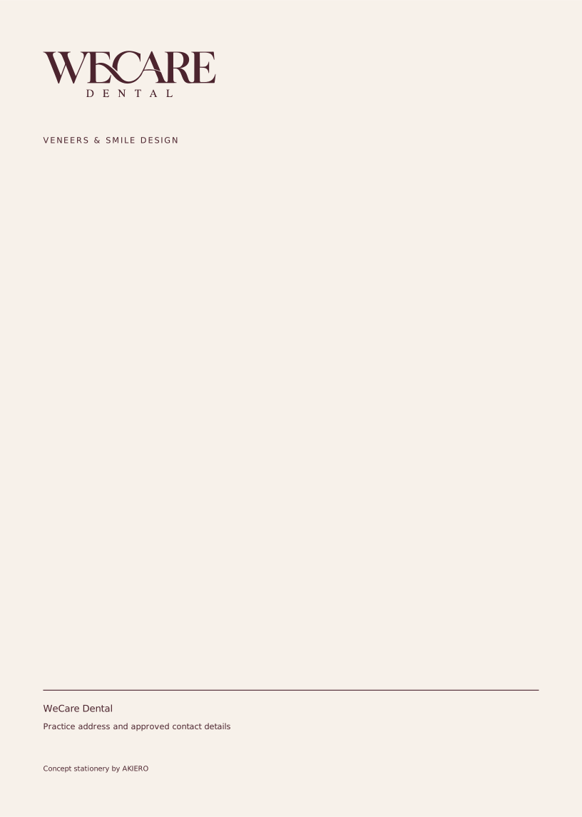
Business / appointment card: 85 × 55 mm trim with 3 mm bleed. Letterhead: A4 trim with 3 mm bleed. Keep essential text at least 5 mm inside trim. Artwork includes the bleed area.
Replace generic contact fields with approved practice details. The email signature uses system type for compatibility. Send print files through the printer's colour conversion and proof workflow.
WeCare Dental / An individual studyThe likeness journal.
The likeness journal.
The clinic signature
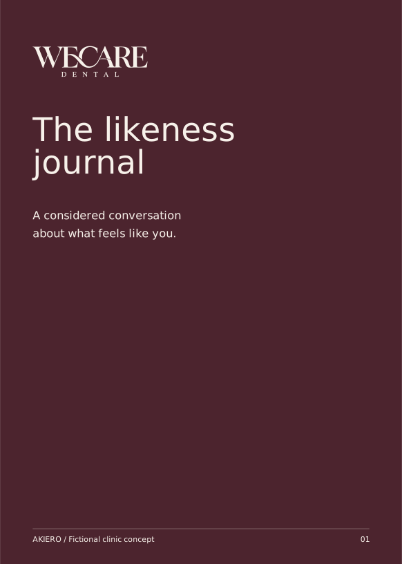
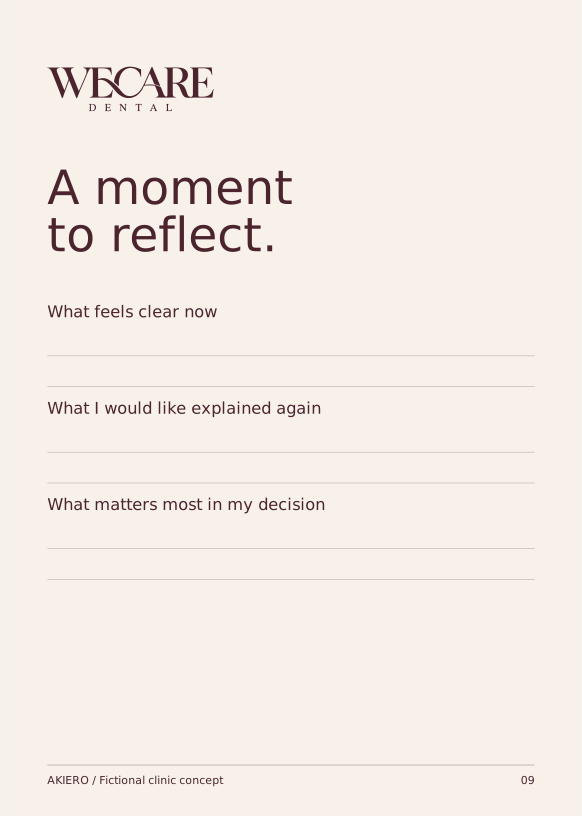
A5, 12-page consultation journal. Uncoated warm-white stock and an oxblood cover. Three sections: Observe, Discuss, Reflect. Includes space for the clinician's notes through the practice's approved process. It is a conversation aid, not a treatment plan.
How the team uses it
What feels clear? ____ · What needs another conversation? ____ · My next step, when I am ready ____
The complete printable signature document is included, alongside editable page masters. The practice completes personal and clinical details through its approved process.
WeCare Dental / An individual studyA recognisable place to arrive.
A recognisable place to arrive.
Reception →Consultation →A moment to reflect →
Arrival line
An individual approach.
Materials
Porcelain-toned plaster, dark timber and a quiet oxblood textile. Apply the complete wordmark in matte paint or metal. On paper and cloth, a restrained deboss can carry the identity.
Uniforms
Porcelain or charcoal clinical attire with a small oxblood or porcelain wordmark. Staff names remain plain and readable. Avoid fashion styling that obscures professional roles.
Illustrative material and signage concept. The logo story guides the welcome; detailed fabrication follows the actual site.
WeCare Dental / An individual studyAn asset library ready to use.
An asset library ready to use.
Family
Delivered
Use
Logo family
7 vector SVG files
The primary logo is WECARE with DENTAL beneath. Use WECARE alone only where the practice is already clearly identified. The identity has no standalone emblem or W monogram.
Graphic system
Pattern + 6 individual icons
Transparent SVGs; character treatments also supplied for the children's practice.
Social
2 feed posts + 1 story
Editable SVGs, fonts embedded; raster exports included in the presentation bundle.
Print essentials
Card front / reverse + letterhead
SVG files with specified physical artboards and 3 mm bleed.
Clinic signature
Complete printable document + SVG pages
A5, 12-page consultation journal. Uncoated warm-white stock and an oxblood cover. Three sections: Observe, Discuss, Reflect. Includes space for the clinician's notes through the practice's approved process. It is a conversation aid, not a treatment plan.
Team tools
Email signature + design tokens
Editable HTML, JSON palette and spacing tokens, complete brand copy.
SVG logo masters contain outlined lettering and remain sharp at any size. Collateral SVGs contain editable text and embedded fonts. Keep the editable sources alongside exported PNGs.
Source naming: asset-purpose-variant.svg. Use the supplied approved colour versions. Copy a master before adapting it, and name new exports with the channel and date.
WeCare Dental / An individual studyThe promise has to show up.
The promise has to show up.
01
Enquiry
Invite the person to describe what they want to understand.
Practice coordinator
02
Welcome
Offer the journal and explain that preferences begin the conversation.
Coordinator
03
Consultation
Discuss preferences, clinical suitability, alternatives and limitations.
Treating clinician
04
Reflection
Provide an agreed next step without artificial urgency.
Clinical team / coordinator
These are proposed service behaviours for the fictional concept. The clinic owner must confirm capability, train the team and adapt the process before the promise appears in live marketing.
WeCare Dental / An individual studyDetails that keep the system intact.
Details that keep the system intact.
Layout
Use a six-column editorial grid with generous outer margins. Align body copy to one consistent edge. Keep one large typographic gesture per composition. Square corners for paper; softly framed portraits only.
Legibility
Use approved high-contrast text pairs. Normal text should meet at least 4.5:1 contrast, and large text 3:1. Convey meaning through words or shapes as well as colour. Keep meaningful content available when imagery is absent.
Motion
A single 300 ms opacity reveal may introduce a portrait. No looping glamour effect, simulated transformation or animated whitening. Reduced-motion keeps all content static.
Digital exports
Use SVG for identity and icons. Export social artwork as PNG at the stated size. Keep the colour space sRGB. Compress editorial photography for web without removing useful texture.
Print production
Use vector artwork and 300 ppi placed images at final size. Bleed is 3 mm where specified. Keep a 5 mm text-safe margin inside trim. Ask the printer to convert using its output profile and supply a proof.
Photography and clinical content
Keep concept photographs labelled as illustrative. Use only approved real-clinic imagery for live work. Verify service claims and clinician credentials; this identity does not establish a dental specialty or an outcome.
WeCare Dental / An individual studyKeep the idea recognisable.
Keep the idea recognisable.
Before anything goes live.
Confirm that the story and promise match the practice.
Select the correct logo master and check clear space.
Use the supplied colours, type and graphic family.
Read the copy aloud against the voice examples.
Verify all service, contact and clinician information.
Check mobile reading, contrast and alternative text.
Review image permissions and illustrative labels.
Get practice-owner approval and keep a dated master.
A brand refresh should preserve these principles. Changes to the promise, logo or type system need a deliberate review rather than a one-off campaign decision.
Give the name, the person and their questions enough room.
Concept identities by AKIERO. All clinic stories and avatars are fictional. Name and mark clearance, clinical review and production proofing remain prerequisites for real-world use.